
However, when approached with the right strategy and visual tools, complex data can be transformed into a compelling story. The goal is to communicate insights clearly, effectively, and in an aesthetically pleasing way. One of the best ways to achieve this is by using well-designed PowerPoint templates that help manage and present data visually. In this article, we'll explore how to make data-heavy presentations look stunning while ensuring clarity, engagement, and impact.
Understand Your Audience
Before diving into charts and graphics, take a moment to think about your audience. Are they data-savvy professionals who appreciate granular details? Or are they executives who only want key takeaways? Understanding your audience’s background, preferences, and expectations will help determine the level of detail you include and how it should be visually presented.
For technical audiences, detailed graphs and raw data tables might be appropriate. For business leaders or clients, you may want to focus more on visual summaries and storytelling. Knowing your audience helps you decide what to emphasize and what can be left out.
Tell a Story With Your Data
A compelling presentation isn't just about numbers—it's about the story behind those numbers. Instead of dumping data on your slides, think about the message you want to convey. Are you showing growth? Identifying a problem? Proposing a solution? Once you have a clear narrative, arrange your data to support it.
Create a flow that mirrors a story arc: start with context, highlight a challenge, show evidence, and end with a recommendation or conclusion. This structure will keep your audience engaged and help them remember your main points.
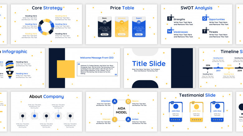
Use PowerPoint Templates to Structure Your Presentation
PowerPoint templates can be a lifesaver when organizing complex data. A good template offers a consistent structure, attractive design elements, and predefined slide layouts that make your content easier to follow. They save time and ensure visual consistency throughout the presentation.
Use templates that include layouts specifically designed for data visualization, such as comparison slides, dashboards, and infographics. These layouts help display multiple pieces of data on a single slide in a coherent and digestible way.
Choosing the right PowerPoint templates also allows you to maintain brand consistency, especially when presenting to clients or external stakeholders. Select templates that align with your organization’s color scheme, typography, and tone.
Simplify and Prioritize Your Content
One of the biggest mistakes in data-heavy presentations is trying to cram too much information onto each slide. The human brain can only process so much at once, so simplify your content and focus on what matters most.
Instead of showing five charts on a single slide, pick one or two that are most relevant. If you have multiple datasets to share, consider breaking them into multiple slides, each with a focused takeaway. Use slide headlines to clearly state the insight each slide delivers.
Prioritize your content by asking: What does my audience need to know? What will help them make a decision or understand the issue? Everything else can be placed in an appendix or provided as a handout.
Visualize Data Intelligently
Raw data is rarely presentation-ready. To make it impactful, use the right type of visualization for the message you want to convey.
-
Use bar and column charts for comparisons
-
Use line charts to show trends over time
-
Use pie charts sparingly and only when showing parts of a whole
-
Use heat maps, gauges, and infographics to create a visual impact
Avoid visual clutter by eliminating 3D effects, unnecessary gridlines, and overly complex legends. Every visual element should serve a purpose.
When using PowerPoint templates, look for ones that offer pre-designed charts and diagrams. This makes it easy to plug in your data without starting from scratch and ensures a polished look.
Incorporate Icons and Illustrations
Icons and illustrations can help convey concepts quickly and break up the monotony of numbers and text. They make your slides more approachable and can guide the viewer’s eye toward important information.
Use icons to label categories in charts, represent business functions, or highlight action items. Choose a consistent icon style throughout the presentation for visual coherence. Many PowerPoint templates include built-in icon libraries, which simplifies the design process.
Illustrations can be helpful for storytelling or explaining abstract concepts. Whether it’s a flowchart, user journey, or product lifecycle, illustrations add depth and personality to your presentation.
Use Color Strategically
Color is a powerful tool in presentation design, especially when dealing with complex data. It can draw attention, differentiate elements, and communicate meaning at a glance.
Stick to a cohesive color palette to maintain visual harmony. Use your brand colors as the base and add complementary colors for highlights or data segments. Avoid using too many colors, which can be distracting and reduce clarity.
Use color to:
-
Highlight trends or outliers in charts
-
Group related items
-
Emphasize callouts or recommendations
PowerPoint templates often come with professionally designed color schemes, which makes it easier to maintain a visually appealing and balanced look.
Use White Space Generously
White space—also known as negative space—is the empty area around text, charts, and images. It helps reduce cognitive load and makes your slides easier to read.
Don’t feel the need to fill every inch of a slide. Allow content to breathe. Group related items together with enough spacing to distinguish between sections.
Using white space effectively can elevate the look of your presentation, making it feel modern and sophisticated. Many PowerPoint templates are designed with white space in mind, offering clean and minimalist layouts that prevent visual overload.
Animate with Purpose
Animation can add a dynamic layer to your data-heavy presentation—when used wisely. Instead of revealing all your information at once, use animations to control the flow and pace.
For example, build a chart step by step to explain each component, or reveal bullet points one at a time to avoid overwhelming your audience. Subtle transitions can also help maintain attention without being distracting.
Avoid overusing flashy animations or effects like spins, bounces, or random zooms. Stick with simple fades, wipes, and appear effects that support rather than distract from your message.
PowerPoint templates often include preset animations aligned with the overall design, helping you achieve a polished and professional effect without much effort.
Provide Context and Interpretation
Numbers don’t speak for themselves. Make sure you’re interpreting the data for your audience. What does a 12% increase mean? Why is this metric trending downward?
Use labels, annotations, and brief text explanations to guide the audience’s understanding. Highlight key takeaways with callouts or colored shapes. Don’t assume your audience will draw the same conclusions you have—be explicit about the story your data tells.
This contextual layer adds meaning to your visuals and helps drive action or decision-making.
Design for Accessibility
Your presentation should be accessible to all viewers, including those with visual impairments or color blindness. This means using sufficient contrast between text and background, avoiding color combinations that are hard to distinguish, and ensuring that charts are readable without relying solely on color.
Use descriptive titles and alt-text when possible. Choose legible fonts and avoid small text sizes. Many PowerPoint templates are designed with accessibility in mind, providing layouts that accommodate these needs without compromising on aesthetics.
End With a Summary
After walking your audience through detailed data, wrap up with a summary slide. Recap the key findings and conclusions, and if applicable, present actionable next steps.
A summary slide helps reinforce the main messages and ensures the audience walks away with a clear understanding of what they’ve just seen. Visually, this slide should be clean and straightforward—think of it as your closing argument.
Use a layout from your PowerPoint template that is designed for summaries or conclusions. This will provide consistency while allowing you to end on a strong visual note.
Practice Delivery and Timing
No matter how beautiful your presentation is, it won't be effective without proper delivery. Practice your timing and narrative flow to ensure you’re not rushing through slides or lingering too long.
Rehearse transitions between slides, especially those with complex charts or animations. Be prepared to answer questions and elaborate on specific data points. A confident and clear delivery complements your stunning visuals and makes your message more persuasive.
Conclusion
Creating a data-heavy presentation that’s both informative and visually stunning is a balancing act. It requires strategic thinking, design principles, and a deep understanding of your audience’s needs. With the help of thoughtfully designed PowerPoint templates, you can transform dense data into compelling visual stories that drive engagement and understanding.
Focus on clarity, simplicity, and storytelling. Use visuals to support—not overshadow—your message. When done right, a well-crafted presentation can make even the most complex data accessible and impactful.
Comments
0 comment